 Words by
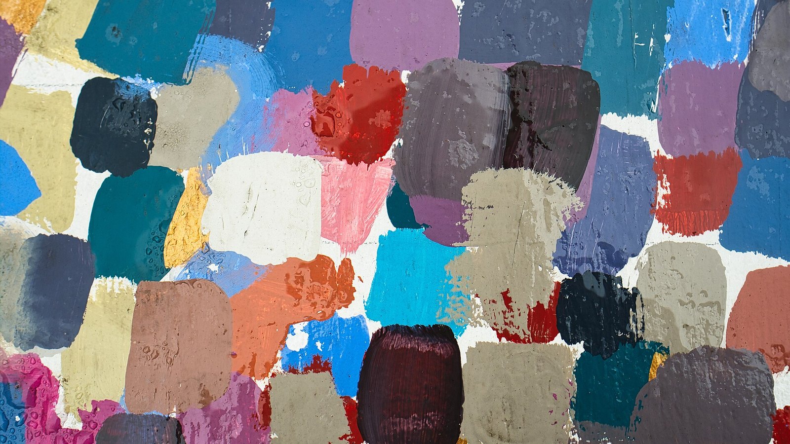
For a few years, picking the paint color of the year was a predictable exercise. One shade family would dominate, and every brand would put out its own version of it. That isn’t what happened for 2027. The major paint companies have now named their picks, and they’re all over the wheel: a mossy green, a pale celery, a smoky blue, a warm orange, a dusty rose, a plum-tinged brown.
What ties them together, according to the brands themselves, is less a hue than a mood. The word that keeps coming up is “grounded.”
Here’s the list, with a few notes on where each one actually works in a house.
Behr, Grounded. A moss-and-olive green with warm brown underneath. Behr’s head of color, Kayla Kratz, told Builder that it answers a shift away from stark minimalism toward rooms with more warmth. It’s a good wall color for a den or a dining room with wood furniture, and it shifts noticeably between morning and evening light.
Sherwin-Williams, Celery. A light, yellow-leaning green that reads more herb garden than forest. It follows last year’s Universal Khaki and marks a turn toward something brighter. It’s an easy kitchen color and pairs well with white cabinets or natural oak. Test it next to your trim first, since yellow undertones can look sour against a cool white.
Benjamin Moore, Webster Green. A classic deep forest green. Benjamin Moore’s pitch is longevity over trend, which makes sense given how many green rooms have been painted since 2020. It works on cabinetry, a front door or a library wall.
Glidden and Pittsburgh Paints, Artifact. A mid-tone, smoky blue that leans warm. Glidden’s Ashley McCollum called it “not a reinvention, but a readjustment.” It suits bedrooms and home offices, places where you want to sit still.
Valspar, Cottage Door. Another warm mid-blue, which Valspar is positioning as a “new neutral.” If you’ve been living with greige and want color without much risk, this is the safer of the two blues.
Dutch Boy, Deep Rooted. An earthy, warm orange. It’s the boldest pick on the list and the one most likely to show up as an accent: a powder room, the back of bookshelves, a front door on a brick house.
C2, Pueblo. A muted rose that sits between floral and earth tone and changes a lot with light. C2’s Phillipa Radon said it “resists a single definition.” Try a large sample board in the actual room before committing.
Dunn-Edwards, French Press Coffee. A deep brown with a plum undertone. Dark browns have been creeping back into design for a couple of years, and this one is warmer and more complex than the flat chocolate shades of the 1990s.
Rust-Oleum, Mauve Classic. A warm mauve that Rust-Oleum named its 2027 wall paint color of the year. Mauve has a dated reputation, but in a warmer, grayer version it can soften a bedroom or a hallway that gets little light.
The idea behind the list
Brand color teams spend a year or more on these selections, pulling from fashion, product design and consumer research. The explanation this year leans heavily on screen fatigue. Lisbeth Parada of Dutch Boy described a pull toward color that makes a home feel “personal, welcoming, and comfortably lived in,” and several brands talked about rooms meant for recharging rather than for showing off.
You don’t have to buy the marketing to notice the practical upshot. Almost everything on the list is a mid-tone or deep color with warm undertones. Stark white walls and cool gray, the defaults of the last 15 years of flipped houses and new construction, are nowhere on it.
Before you buy a gallon
Paint chips lie. A color that looks soft on a two-inch card can go loud across four walls, and north-facing rooms will push most of these toward gray. Buy a sample, paint a two-foot square on two different walls and look at it over a full day. Most of these shades are better on a single wall or a small room at first. If you still like it after a week, then paint the room.
And if none of them appeals, that’s fine too. The colors of the year are mostly a way for paint companies to start a conversation. The right color is still the one you’ll be happy to look at every morning.
Add Amore Magazine as a preferred source on Google (opens in a new tab)